Tasks: roadmapping feature
Tasks (also known as GSD) is a large company’s internal tool created to help with project management.
Role
Product Designer
Team
2 Product Designers
3 Engineers
View prototype
Challenge
How might we consolidate status updates while still providing ample information?
Objective
Enable feature parity with Asana to minimize the impact once the migration off of Asana happens.
Define ✍🏽

Where’s the research?
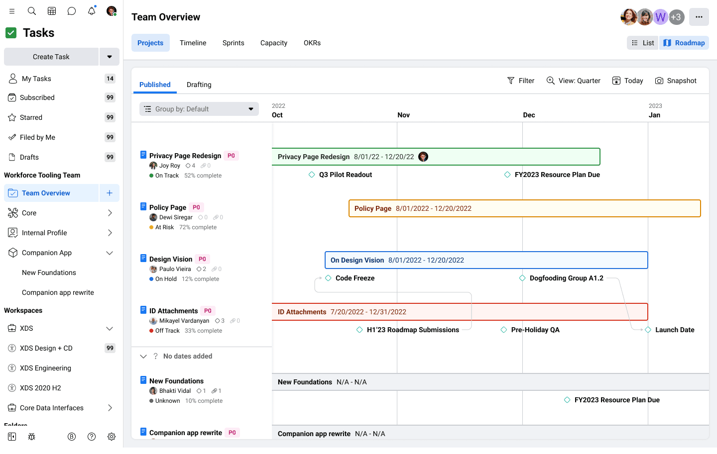
I collaborated with the UX research team to gather insights from company-wide migration efforts and identify essential Asana features users needed to transition to Tasks/GSD. Two high-priority areas emerged: Roadmapping and Portfolios. Roadmapping enabled teams to view projects on a timeline, sortable by owner or priority. Portfolios provided higher-level stakeholders—like PMs and VPs—with visibility into their teams’ projects. While Portfolios offered a broad overview, Roadmapping delivered a more detailed view—less granular than individual tasks but more focused than the portfolio level.
View projects: Only view
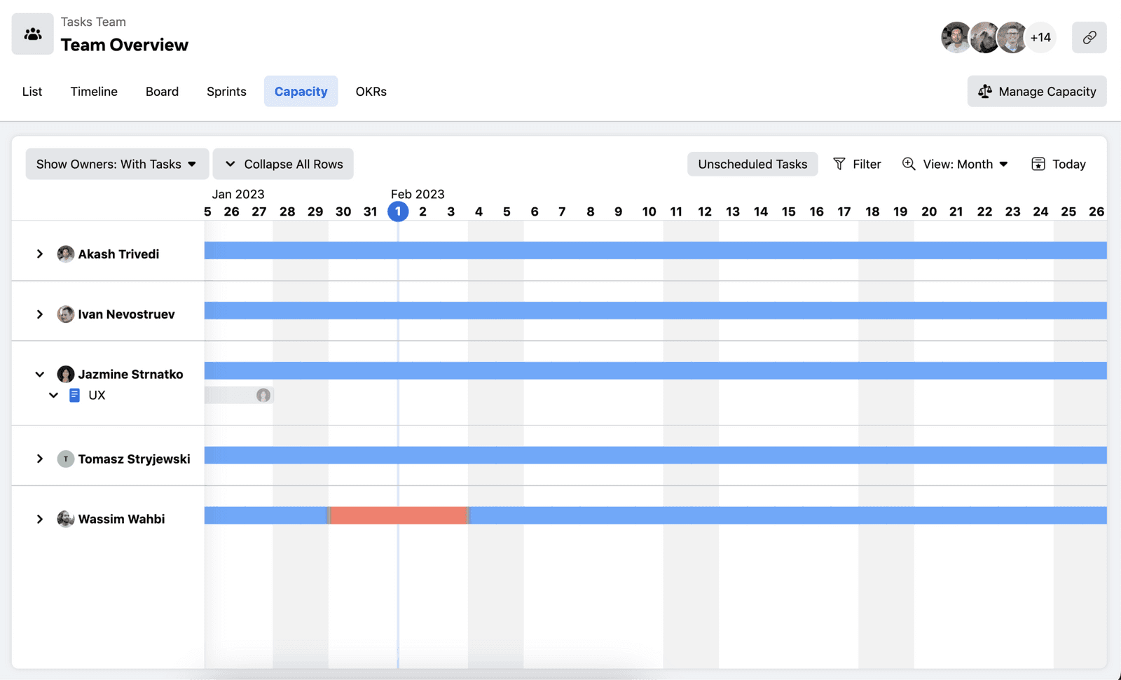
View tasks: By timeline or capacity only

View projects: Only view

How might we provide a visual way to view work at a higher level?
Tasks/GSD was originally built as a ticketing system for engineers, with tasks and projects limited to a table view. Visual representations were restricted to a task timeline and individual capacity views.
While tasks had some visual context, projects remained table-bound, and the project details page offered limited visibility—making it difficult for managers and VPs to quickly scan and assess multiple projects at a glance.
Design 🎨
How might we design similar yet distinct experiences that deliver meaningful value and impact?
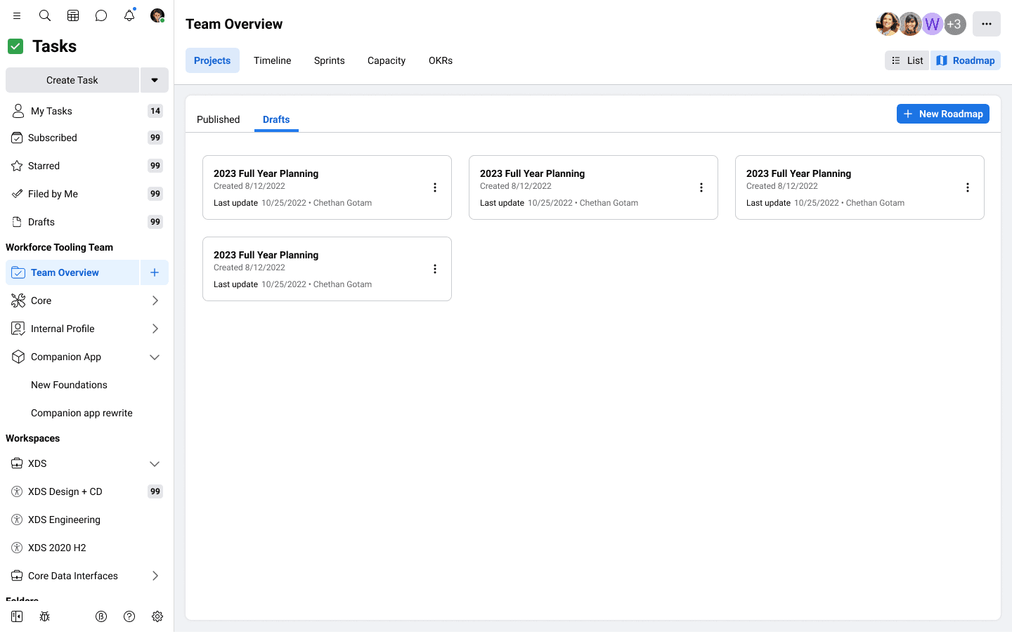
Given the scale of the projects, each had a dedicated designer, with both collaborating to ensure feature consistency. Initial concepts included allowing for multiple saved drafts, but this was scaled back early on to avoid engineering delays of several weeks.
Given the high priority of these features, delays weren’t an option. In line with the company's "Move Fast" motto, we prioritized releasing an MVP, with plans to revisit the concept after addressing other top priorities.
Early iterations of the popover
The final product resulted in two features that while similar in initial concepts, provided a consistent experience between the two. While this case study focuses on the roadmapping feature, below highlights final screens from both Portfolios & Roadmapping.
Portfolio's timeline

Roadmaps's timeline

Takeaways 🍬
Collaborating within shared design ownership.
Previously, I had always been the sole designer on a project. This experience was my first time sharing a product with another designer, and it taught me how to truly collaborate—aligning on vision, dividing responsibilities, and co-creating within the
same space.
Similarity doesn’t always mean sameness.
This project ran in parallel with another that shared many overlapping features. At first glance, they seemed nearly identical—but subtle differences in purpose, audience, and experience emerged. Recognizing and defining those nuances became essential to creating meaningful differentiation between the two.