Understanding team availability at a glance
Create a unified calendar status system that communicates availability at a glance to improve coordination and team efficiency.
Role
Defined the project scope by auditing existing calendar statuses, mapping their sources, and identifying redundancies across systems.
Led discovery and established the standardized framework for how status information should be surfaced and maintained within the calendar.
Integrated status indicators with office badging data to provide real-time, location-based visibility of employee availability.
Impact
Reduced status clutter by 47%, making calendar events the focal point and improving overall user experience.
Increased in-office collaboration by highlighting coworkers in the same location, fostering better teamwork and camaraderie.
Eliminated duplications and unclear statuses, improving clarity and boosting team coordination by approximately 10%.
The status overload problem
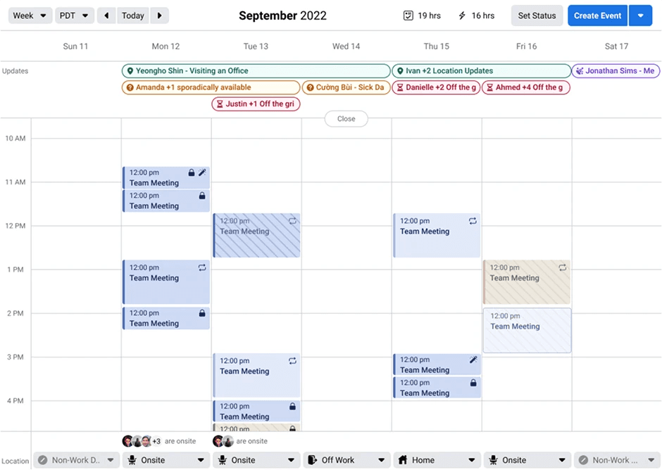
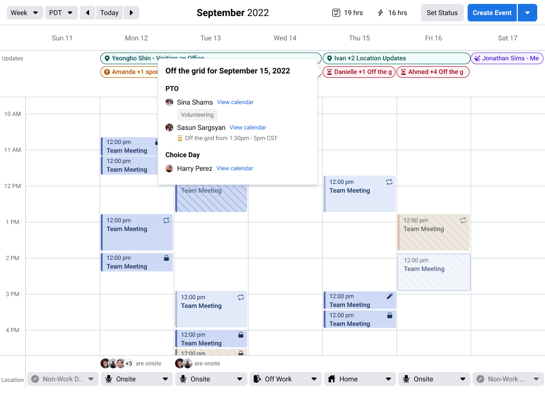
User feedback, particularly from managers with many direct reports, revealed a major pain point: the calendar was overwhelmed by status “events.” Each time an employee was out, partially in-office, or in a new location, a separate event was created—even if a single person had multiple statuses in one day or the same type of status.
Multiple people being out on the same day compounded the problem, cluttering the view and obscuring the calendar’s core purpose: helping users see their daily events at a glance. This overload created confusion and made it difficult to quickly understand who was available and where.
Example of a person's calendar
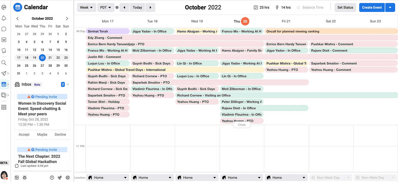
Several issues made the calendar status view difficult to use. The complexity of the status area was compounded by the variety of information it needed to surface. Teammates’ statuses could include PTO, sick days, travel, on-call, and more, while also indicating availability such as available, sporadic, or off the grid.
Pain points
Too many statuses pushed content further down the screen, making it hard for larger teams to quickly see where teammates were at a glance
Status colors were inconsistent and unclear
Some statuses—like “Comment”—didn’t explain why a colleague was out
Users were following people who were no longer relevant
Understanding the status challenges
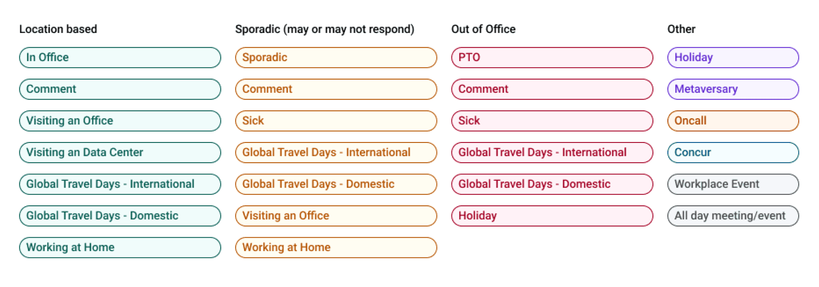
To begin, I conducted a full audit of all statuses in circulation, documenting their definitions and identifying their sources. This allowed me to untangle the complexity and better understand how each status contributed to the overall calendar experience.
From this analysis, I was able to consolidate the wide range of statuses into four main categories: location-based, sporadic, out of office, and other. While some statuses overlapped across categories, the primary driver was whether—and where—a person was working. This framework created the foundation for standardization and a more intuitive status system.
Data came from multiple sources, including Meta’s internal Status Tool and Workday, sometimes with privacy restrictions. Together, these factors created a cluttered, inconsistent view that slowed decision-making, hindered coordination, and obscured the calendar’s core purpose: helping teams see who’s available at a glance.
Understanding employee needs
I analyzed how different types of employees—remote, hybrid, and in-office—engaged with statuses and what information mattered most to them. The shift to flexible work models during the pandemic had introduced new complexities, such as distinguishing whether an employee was working from home or in the office on a given day.
By mapping these needs, I uncovered that location visibility was critical for in-office and hybrid employees seeking opportunities to connect with colleagues, while remote employees prioritized clarity around availability and time away. This lens ensured the redesigned system reflected not just organizational structure, but also the realities of how people worked.
As a remote worker, I care about…
If my coworkers are OOO
If a coworker has changed timezones
Do I care if they are visiting a different office?
❌ Not really; it’s nice to view but clutters the page
Do I care if they are in a new timezone but not an office? i.e. remote working
❌ Not really; it’s nice to view but clutters the page
Do I care if a coworker is in office?
❓/ ❌ Helps to see if someone may be late to a meeting but otherwise, not at a quick glance
If someone is visiting an office nearby me
As an office-based worker, I care about…
Seeing if my coworkers are OOO
If a coworker (same office) will be in the same office as me on any given day
If a coworker (visiting my office) will be in the same office as me
If a coworker is working a different timezone than usual
Defining the grouping logic
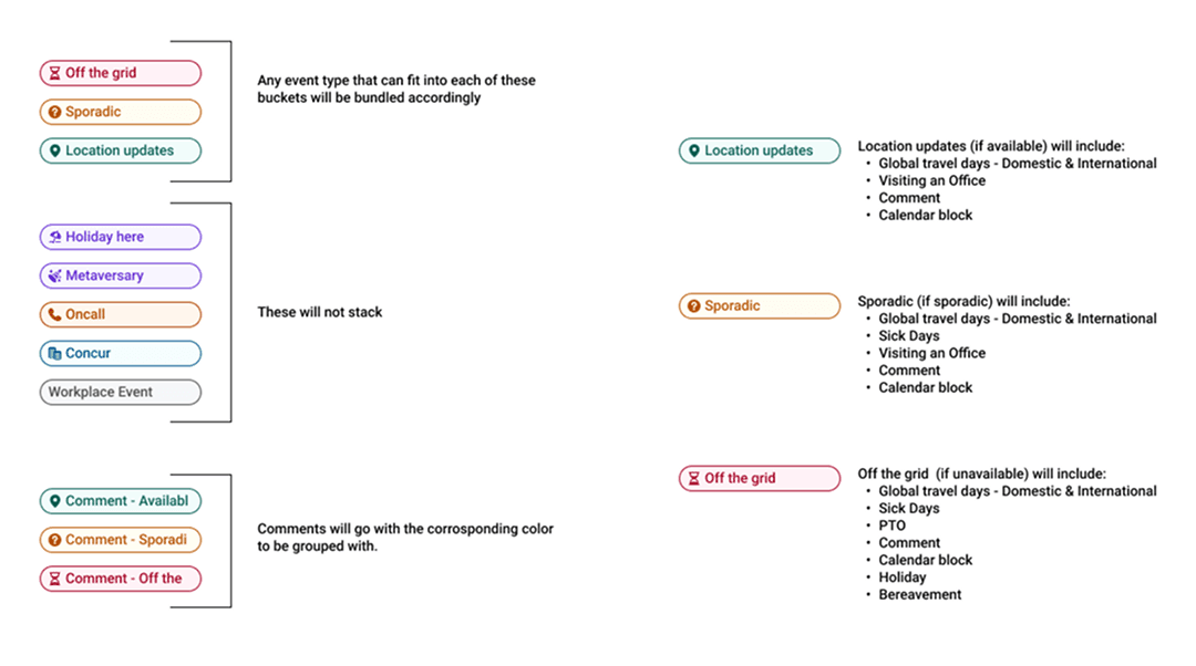
Statuses could logically be organized in two ways: by the type of status itself (e.g., “Sick” or “Travel”) or by availability. For example, “Sick” could exist independently of whether someone was available or not. After evaluating both approaches, we chose to group statuses by availability first, since the most critical question for users was whether a colleague was available. Once availability was clear, location and specific status details provided additional context.
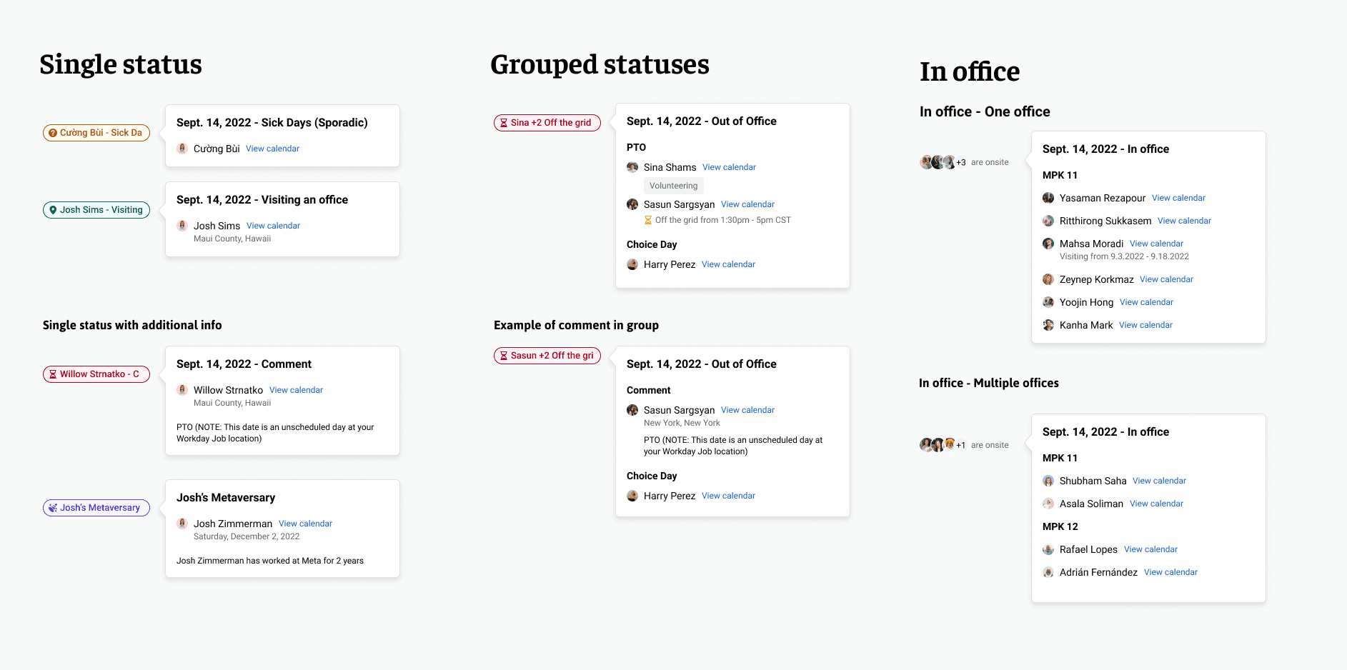
Groupings & behavior of the statuses
Defining how events appear when grouped
Since statuses were now primarily grouped instead of appearing as individual events, the popover had to be updated to reflect this change. The new logic accounted for different scenarios while keeping the interaction lightweight and easy to scan.
Single statuses continued to appear as they do today but with the updated UI. Grouped statuses broke down into clear categories and displayed relevant details such as comments, visiting a location, or partial availability. Partial statuses functioned similarly to all-day statuses but included an additional line specifying availability and timing (e.g., “Off the grid · 1pm–5pm CST”), ensuring clarity around when and how someone would be available.
Groupings & behavior of the statuses
Final outcome
The final product largely aligned with my designs, with the key change being that “sporadic” availability was grouped under out-of-office statuses. This approach reduced clutter in the calendar, allowing employees to focus on their events while still maintaining awareness of teammates at a glance. Additional details remained accessible through the updated popovers, and this release served as the first step in a longer-term effort to streamline and modernize the calendar experience company-wide.
Get in touch if you want to learn more about this case study.